KENZO is taking a slower approach to Pre-Spring: A Summer with No Big Plans
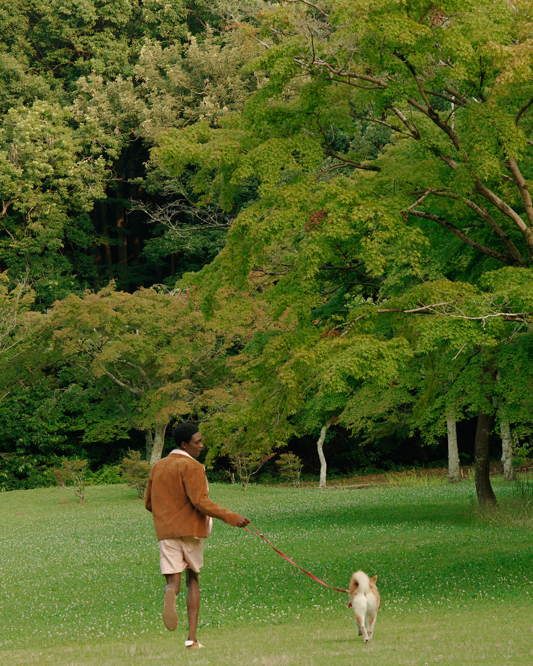
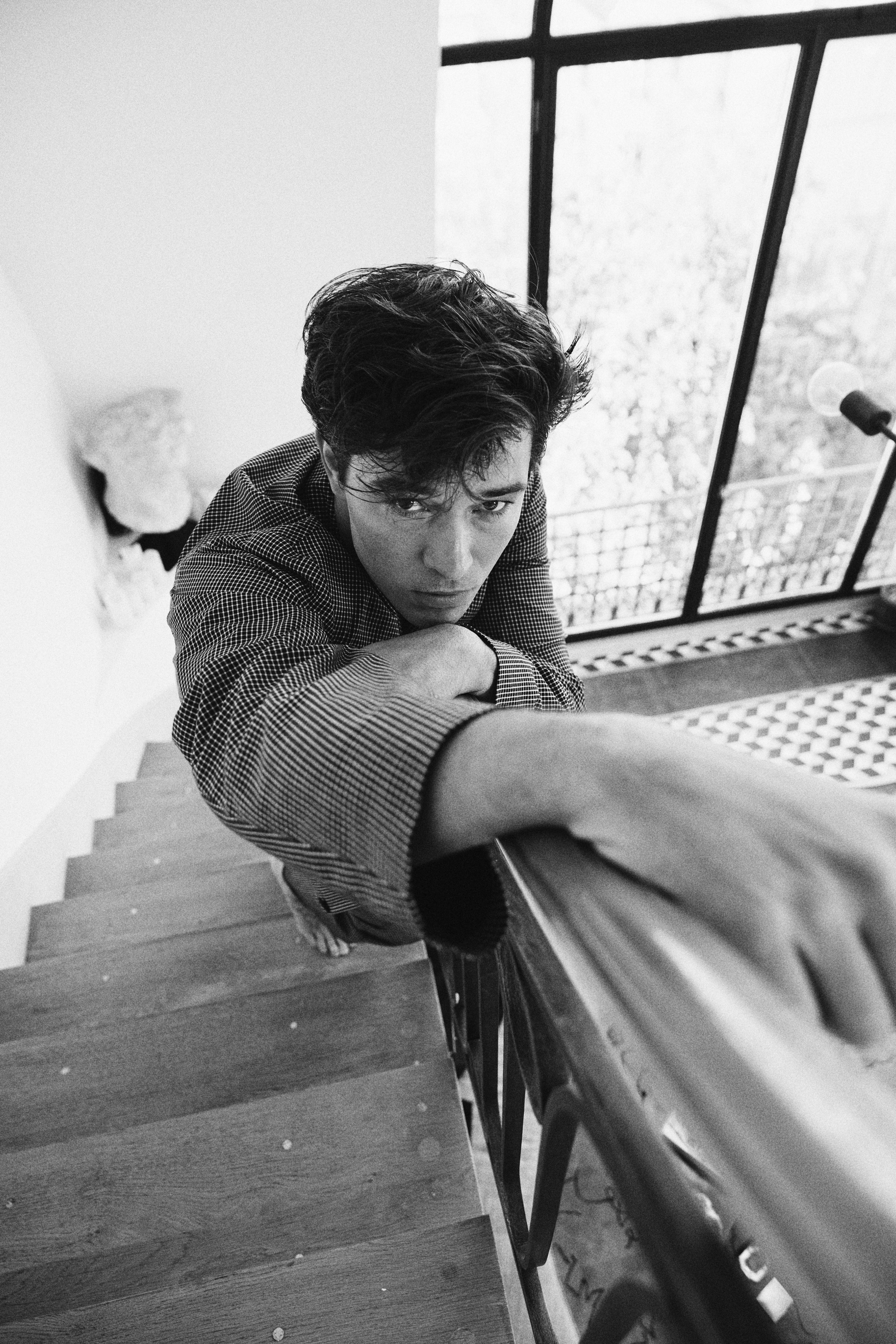
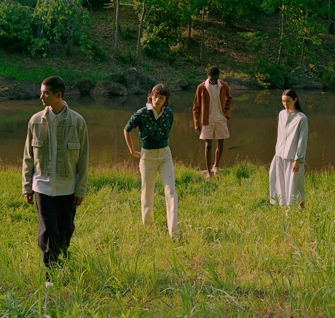
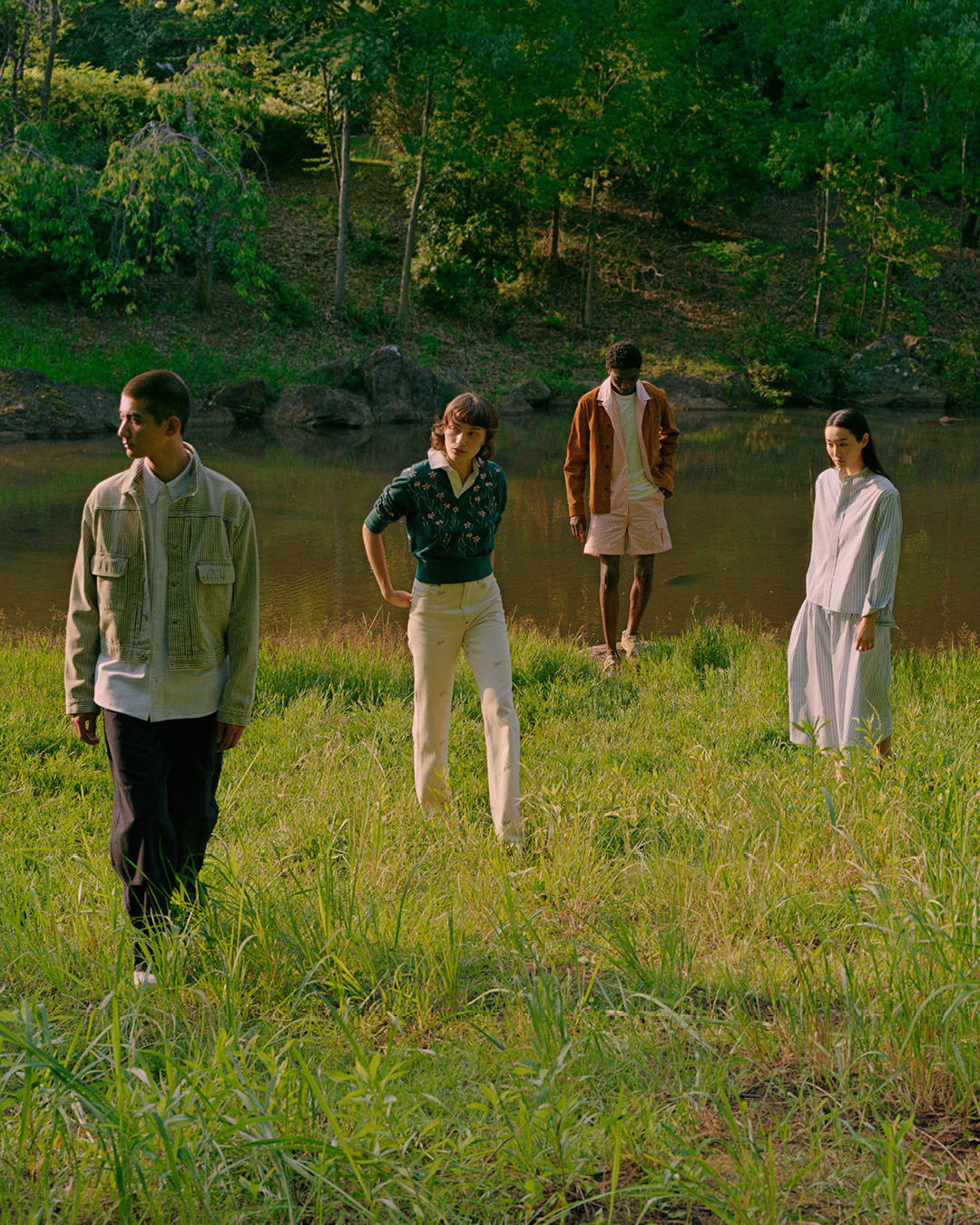
For its Pre-Spring 2027 campaign, Nigo leaves some of the brand’s sportier energy behind in favour of something more relaxed: workwear, soft tailoring, familiar knits and flowers scattered across denim. Photographed by Piczo in Chiba, Japan, the campaign moves between a ceramics workshop, a traditional Japanese house and the outdoors, following the ordinary rhythm of a summer day.
First introduced through KENZO‘s archives and revisited by Nigo for the season, the label becomes a starting point for a wardrobe that moves between activity and downtime. The clothes look made to be worn, lived in and thrown on without too much thought. Even the campaign feels like a summer break in the countryside, where the day has no particularly urgent plans.
LESS SPORT, MORE EVERYDAY
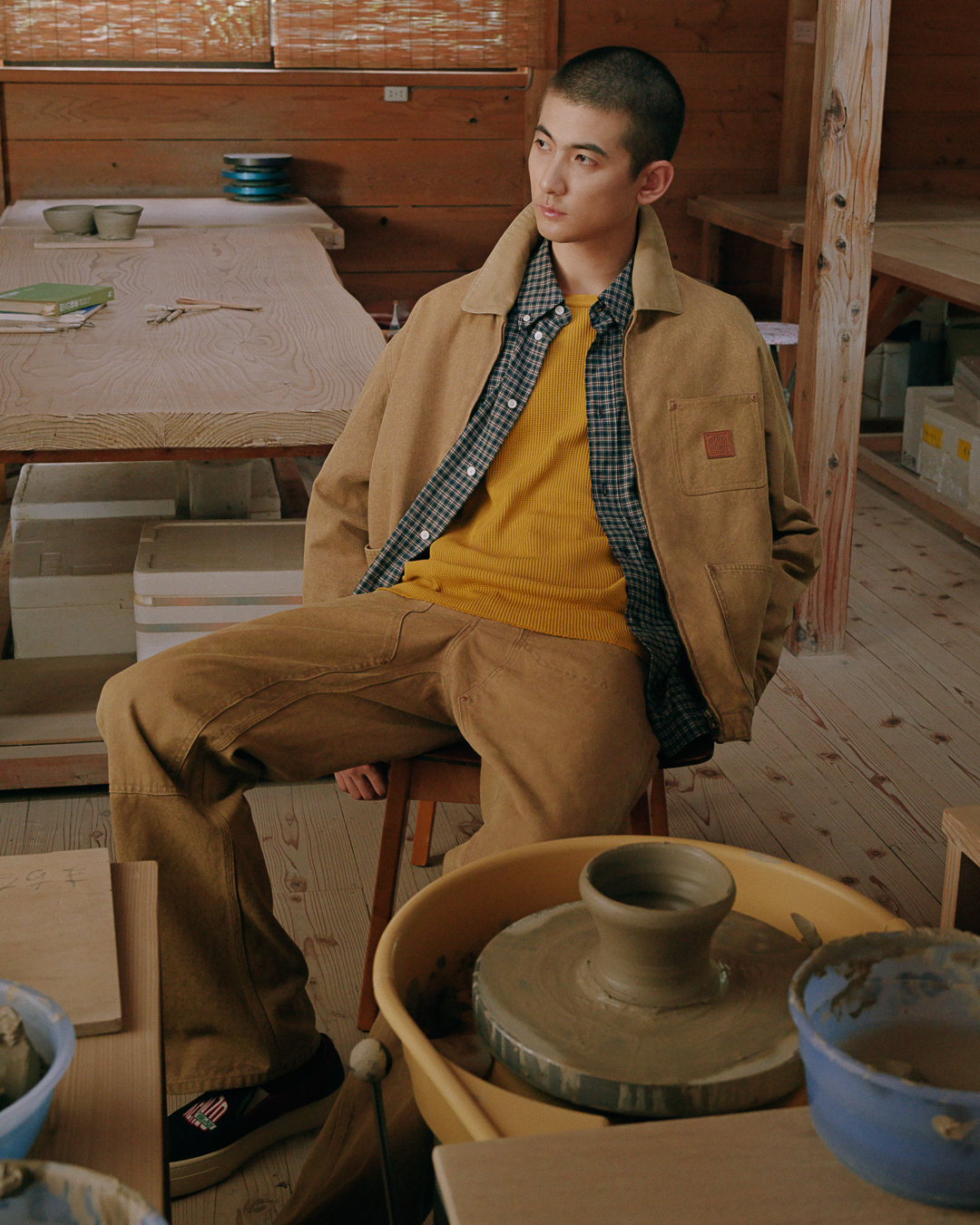
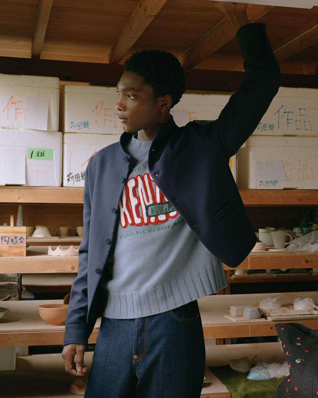
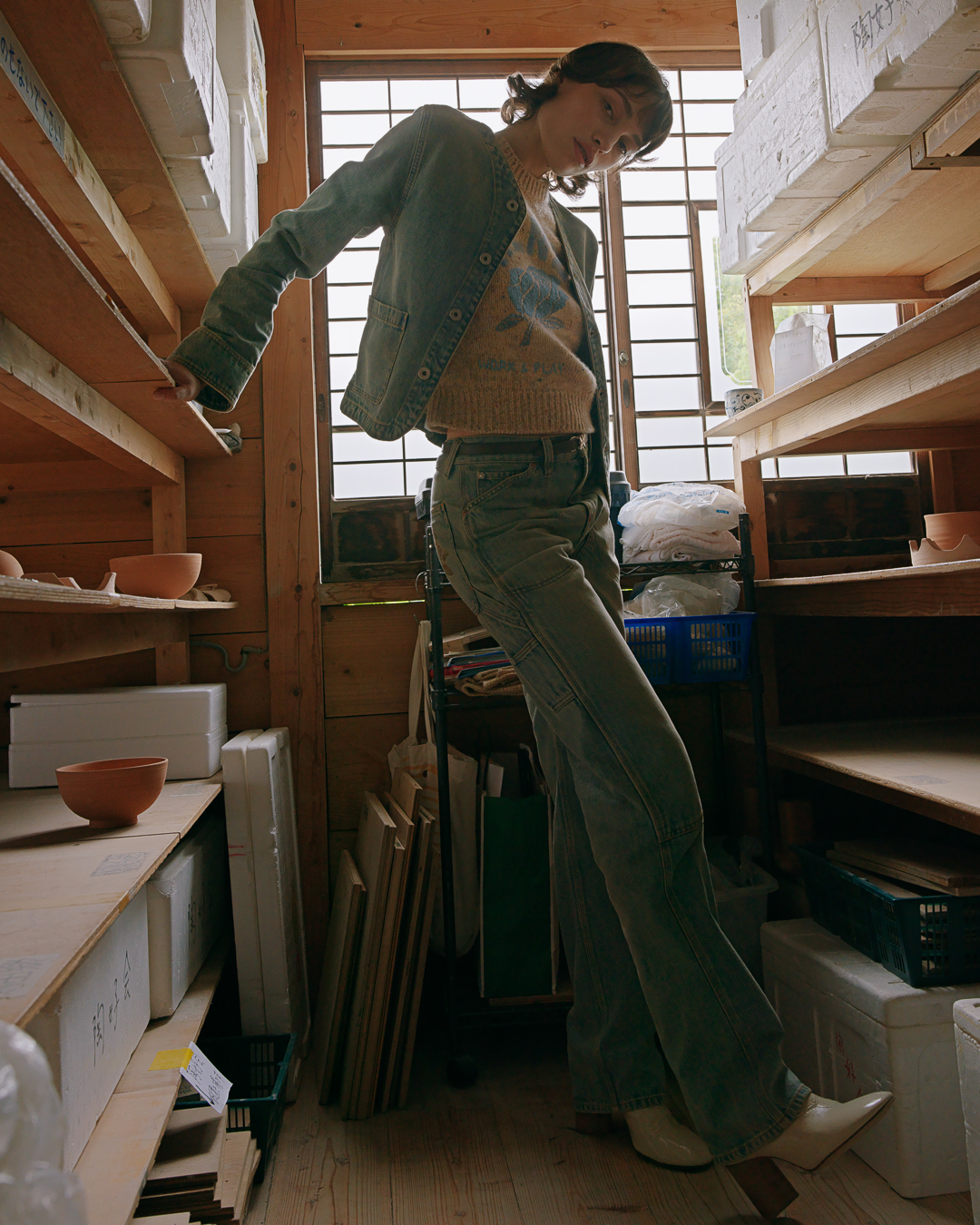
Denim remains central, appearing in embroidered sets decorated with small floral motifs, while varsity-inspired jackets bring a familiar American sportswear reference into the mix. But the collection feels less focused on athletic energy than on everyday dressing. A puffer bomber sits alongside cleaner, more tailored cuts; wide-leg trousers and soft knitwear keep things comfortable, while wrinkled loafers give the styling a slightly undone finish.
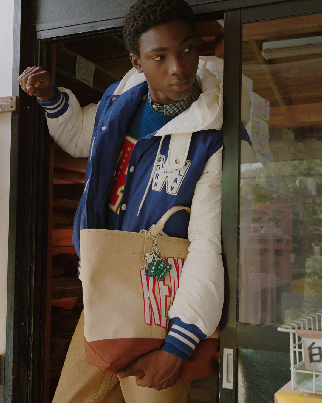
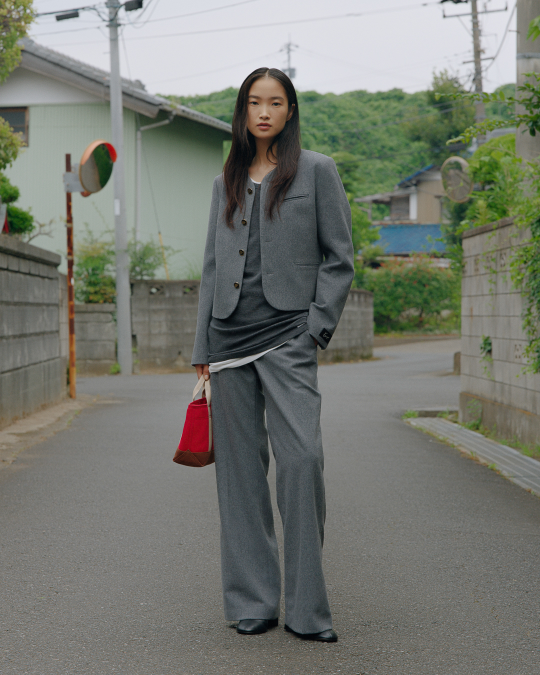
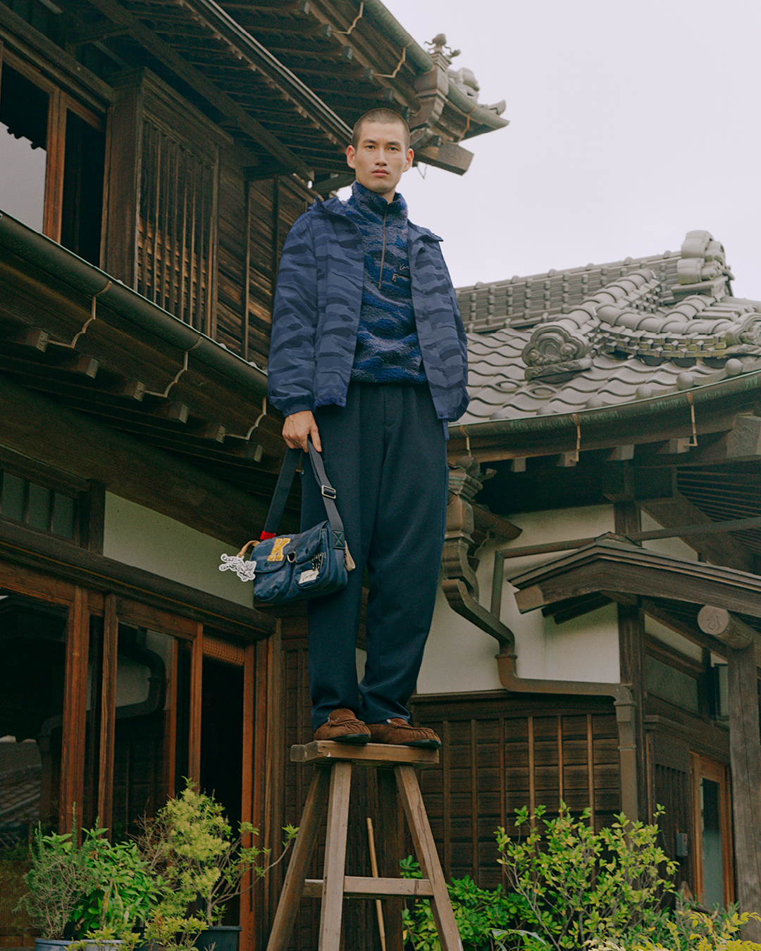
A grey suit, a long shirt dress and muted knitwear offer a break from the more graphic pieces without feeling out of place. The palette moves through dark green, several shades of blue and red, with light pink appearing as a softer accent. Compared with KENZO’s louder combinations, these colours feel grounded and easy to wear. Maybe too easy.
FLOWERS, BUT MAKE THEM KENZO
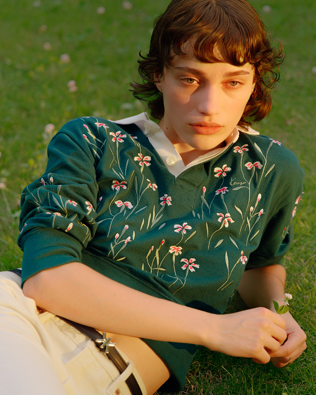
Nigo hasn’t abandoned the patterns. The collection still has plenty of them, from blue monochrome camouflage to floral embroidery and the season’s Ikat Flower motif, which draws on the Japanese Kasuri textile tradition. Some flowers appear in small, scattered arrangements across denim; others are sewn into knitwear, where they sit against a shirt collar or a more traditional silhouette.
The balance between Japanese references and Parisian fashion remains central to Nigo’s KENZO. Craft and familiar wardrobe staples sit together, with the ceramics workshop in the campaign connecting to his own interest in pottery. The references aren’t limited to prints or decoration, either: the campaign’s traditional house and surrounding greenery give the clothes a setting that feels connected to the everyday rituals behind them.
KENZO’s logos are still around, sometimes loud and unmistakable, sometimes absent altogether. There doesn’t seem to be much of an in-between. That contrast works in a collection where graphic statements share space with pieces that are almost deliberately ordinary.

A SUMMER WITH NO BIG PLANS
What makes the campaign appealing is its sense of freedom. The clothes don’t look like they’re waiting for a big occasion, and the images avoid the polished, high-energy mood that often comes with sportswear. Instead, there’s a feeling of comfort, familiarity and play: sitting around, spending time outdoors, wearing the same favourite jacket again.
KENZO still has its patterns, flowers and occasional in-your-face logo moments, but the overall vibe is quieter this time.
BTW, I just realised the KENZO World campaign turns 10 this year. Margaret Qualley doing that absolutely unhinged dance routine? Still haunts me. Rewatching it feels like a fever dream, and honestly, I kind of miss when fashion campaigns were this insane.